Wednesday, March 14, 2012

Art vs. Design


Lana Barth

In my heart of hearts,  I am a frustrated artist;  and there would be nothing more soul-satisfying for me as a designer than to design an artist's in-home studio, an atelier. So I proposed one for this year's D.C. Design House. Unfortunately, the idea was rejected, but to all you frustrated artists, art-loving designers, and other art- possessed human beings  -- this post is for you..


Before I started my "design house home atelier" project, I researched a few famous real ones to discover how they were done. This fabulous studio belonged to Jean-Loup-DorauxIt was sent to me in an email by decorative artist  Kami Tremblay, whom I have contracted in the past for some unique projects for my clients. www.kamitremblaydesign.com/


This wonderful studio belonged to Norman Rockwell. It is a masterpiece of organization,  just like his work. 

My atelier was to showcase the delightful, whimsical and colorful art of Susan Finsen. http://www.susanfinsen.com .This is Susan's actual studio at the Torpedo Factory in Alexandria, Virginia. 


For Susan's "design house atelier",  I selected this industrial console from Dovetail.  I think it's a unique  vehicle for her to store her paints as well as  fabrics for collages and other art supplies. http://www.dovetailfurniture.info/ (available through designers).

And her industrial work table, also from Dovetail. Imagine it splattered with paint. 

This 4'  x 2' recycled wood light fixture is ample enough to light up her work table, and interesting enough to contribute to the atelier mood.. 

and this beautiful easel from Plaza Art Supplies in Bethesda and Rockville would surely inspire her work. http://www.plazaart.com/
Speaking of inspiration, Susan gave me this quote from artist Pat Steir that actually does inspire her: "Because I don't plan my work I don't know when it's not going according to plan. For me, a bad day is when I'm too controlled..."


In my opinion the difference between art and design is also a paradoxical relationship between the two:  Artists are free to be chaotic whereas designers need a plan and control to make the design work.  Having said that, some of my favorite designs have that je ne sais quoi.  The design of an atelier represents ne plus ultra in "controlled chaos." 

Monday, February 27, 2012

Martyn Lawrence Bullard

    Post by:                             
Lorna 
Gross
On Tuesday, February 21st, I attended a seminar led by Martyn Lawrence Bullard, a designer from the television show, Million Dollar Decorator.  The event was hosted by the Washington Design Center in Washington DC and was moderated by Karen Sommer Shalett, Editor in Chief of DC Modern Luxury.
Since I had just selected some of his new fabrics last week from the Schumacher showroom for upcoming projects, I was thrilled to attend.

Martyn explained the process and development of designing his new fabric collection. Much of his inspiration comes from his many travels, particularly to Instanbul. He adores paisley but when designing the fabrics he tries to take traditional elements and giving them a fresh slant. Other examples in the collection such as the modern handmade ikats show this mixture of elements. It is easy to see the exotic twist in these patterns that come in striking color combinations.

I’m drawn to his fabrics because of their strong color palettes and global influence.  Here are some of my favorites from Martyn’s collection. To see his full line from Schumacher you can go to:

http://www.fschumacher.com/collections/martyn-lawrence-bullard.aspx.


Raja Embroidery - 65812 Jewel


Nebaha Embroidery - 65792 Charcoal


Romanesque Velvet Stripe - 65840 Caravan


Darya Ikat - 174834 Jewel                  


Raja Embroidery - 65813 Stone 


For more information on Martyn and his work you can visit his website at http://www.martynlawrencebullard.com/; and to purchase his recently published book Live, Love, and Decorate you may go through http://www.rizzoliusa.com, the publisher’s site.


Until next time, Lorna Gross, SAVANT Interior Design


Monday, February 20, 2012

It's About Time

Carol Freedman


I am just wild about the stylized and unusual clocks that are available in the marketplace now.  What a wonderful way to create a focal point in a room, ornament a corner, or spice up a tabletop!  I think it's about time to take a look at some of the timepieces that make my heart tick faster when I look at them!


This first dynamite clock is from Luna Bella, and is available through designers. 
I love the texture created by the distressed metal workings, and its overall iconic feel.
Let the buyer beware though--- it's just for show! 


The following clock has a similar bold and classic impression,
 but it's at a much lower price point...and it really works!
Also available through designers, from Uttermost...


Another Uttermost wall clock, that I think would look terrific in a game room or den,
is comprised of repurposed license plates!


I found the next clock on Etsy, which always has wonderful and unique
hand-crafted items for the home....


I love the stark, irregular graphics of this Barbara Cosgrove clock,
with a nickel diameter, black face and funny numbers....
You can acquire it through your friendly, neighborhood interior designer...

There are some amazing table clocks to look at as well.
This is really an art piece, also available from Luna Bella....


I love this wacky wake-up clock from Brookstone...It's called the
Tocky Rolling Alarm Clock... When it's wake-up time, it jumps off your nightstand,
and rolls around the room until you get up to turn it off.  It will also record custom wake-up messages or music to liven up your rise-and-shine moments!


Running out of time!  When you have a moment,
 I hope that you will share some of your favorite clocks with me too!

Tuesday, February 14, 2012

Frederick Antiquing

  Post by:
Marika
Meyer
One of my favorite weekend activities is heading out of town to go antiquing. A favorite destination is Frederick, Maryland.Two weeks ago I headed directly to The Loft at AI and instantly found a number of items that were worth the drive. This chair and ottoman reminds me of the wicker suite of furniture that I painted black this spring for my back yard. It feels much more updated and transitional than original white. Adding fresh upholstery will make these suitable for a more urban installation. I'm thinking white cushions with bright contrast piping.


The Loft had plenty of garden ornaments; this set of stone markers was particularly tempting. I imagine these in an English garden surrounded by well-groomed boxwood and lush lawn. 


This twig chandelier reminds me of the one by Wish Designs which we recently installed in a turn of the century Victorian in upper Georgetown. 


We opted for one painted white to reflect the neutral palette of the home. 


By far the most spectacular item that I found was this antique Chinoiserie secretary at the Antiques Emporium in downtown Frederick. This fabulous piece was in pristine condition and literally made my mouth water. I have visions of projects that I could use this for, but mostly it made me think of Charlotte Moss's guest room in her home in 
Manhattan home which was inspired by a Chinoiserie writing table.


Other pieces that stood out are this faux bamboo arm chair.


19th century elephant lamp.


Very sweet little french country bergere chair.


I must confess shopping was not the only draw. We planned the trip around a long awaited dinner at Michael Voltaggio's aptly named restaurant, Volt. Most people are familiar with Mr. Voltaggio from his run as a finalist on Bravo's Top Chef. We had heard rave reviews about Volt and were excited to try it with our good friends Scott & Kevan.  Here I am enjoying a glass of wine in the bar after a long day!


I would love to hear about some of your favorite places to go antiquing--please share!

Monday, February 6, 2012


2012 Color Forecast

Cindy Griffin


Sherwin Williams 2012 Color Paint Forecast is inspired this year by surveying the landscape and looking at the palettes of Mother Earth.  The four main color groups focused are Blues, Greens, Neutrals, and Reds. 


Nature’s Blues are drawn from deep waters, summer skies, Navy pea coat, and trusty denim.  Robert Allen Fabrics has teamed up with Sherwin Williams to coordinate beautiful fabrics with the new lines of paint colors.  I found it interesting that even the fabric names have an organic sound.  Here are some samplings and how to coordinate them.


SW6957


SW6810


Burning Heart Chambray


Kay's Picnic Chambray


How do we incorporate these new colors into our existing interiors?  Try a splash of new fabric in pillows, a piece of artwork, or an accessory on the mantel.  Even new table linens, a dining room table or sideboard feature, hand towels, or an entry rug will introduce a new color and feel into your space. 

The Greens for this year are organic – think chlorophyll, Japanese tea, lettuce, forests, and foliage.  Some have undertones of yellows and some have undertones of blues, take a look at these chosen and their coordinated fabrics.


SW6747


SW6467
Garden Party Collection


Paint is the least expensive, most WOW! factor to immediately change a room.  If you don't want to change an entire room, try painting only an accent wall or the back wall of bookcases for immediate impact.

In the Neutrals, think wheat, khaki, creams, and pears – the shades of calm and the solid ground around us. 


SW6108


SW6115


Artisan Texture


And for the powerful Reds – they, too, are inspired from mother earth - glowing ember, an ancient hand print, first natural pigments, and aboriginal colors from caves aged with patina.  Red is always passionate and these deep, rich colors invoke that lively spirit in me.  A glass of red wine would be a must in a room filled with these colors!

SW6321


SW6882


Music Waves Poppy


Johnsonville Poppy


Whether you prefer soft or bold colors in your space, try a small amount of change in a room.  When considering color in rooms, think about the sun and how it travels around your house.  Have some fun, add new color!  ~ Cindy

Monday, January 30, 2012

New Traditions, part II

Lena Kroupnik
I can’t believe January is coming to a close – I’m still catching up from New Years! Everything moves so fast..., but at home I want a sense of calm. I love seeing a young person or not so young take an old piece of furniture and update it – like putting Ikat print or leatherette fabric on an antique chair, for example, or paint wood in unexpected color! To me, that transformed piece of furniture would find its way into a traditional home, perfectly balancing past, present and future. Or just imagine a well-made sofa with classic lines—perhaps a track or roll-arm style—in a neutral color with linen textile. You can change the look instantly with bright bold pillows, a throw, or a new rug – now that’s a New Traditional look with a twist!  Here are some other inspiring combinations:
Love the combination of weathered wood finish and bright orange color  http://www.globalviews.com/
  
In the lines of that beautiful bed I see past and future  http://www.hardenfurniture.com


Contemporary version of a classic Gothic armchair in Lucite by Barry Dixon.

Grange has a collection of unique coffee tables in unexpected finishes - that purple is a winner!t and features built-in trays. Adjustable trays are incorporated into the table. A heightened position allows users to work on their laptop or eat dinner while watching TV! http://www.grange.fr/grange/html/accueil/index_uk.html


Medley Sofa has traditional lines with overall contemporary look  http://www.kravet.com

Hugo Iron/Leather traditional X-Base Bench in Black &White Hide ; how cool!     http://www.arteriorshome.com


1950's plastic sunburst clock at Miss Pixies  for do-it-yourself personalities - refinish in silver!   

Traditional is never out of style, but timeless.


Sunday, January 22, 2012

"Repurposed Goods"

   Post by:
Lana Barth 
 "Repurposed Goods" have been a major design trend for the past few years, reflecting the public concern for our planet;  there was no shortage of repurposed goods represented at the last High Point Furniture Market. I saw most of the following furnishings at Moe's, a showroom that I would describe as modestly priced, youthful, trendy, and socially aware. This first photo is of ottomans casually upholstered in burlap bags. They are fun and earthy, and very eco- conscious.


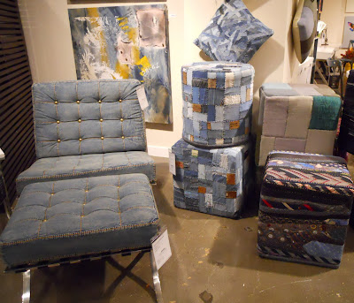
More ottomans, and more repurposed fabrics....this time it's denim and neck ties! Give you any ideas? All you need is a sewing machine and some really old clothes! Also note the tufting with nail heads. Even tufting with rhinestones works.


The "Industrial Look" in furniture is a subdivision of "Refurbished Goods." This collection from Moe's is made of recycled woods and metals with aged patinas. Note the exposed bolts. Big!


This aged metal pedestal is another example of industrial and recycled furnishings. I especially like the way it is paired with a vibrant shiny ceramic vase making each object more important. Opposites attract!


At "Market" there were wheels of all types, but especially bicycle wheels. Could it have some relation to an increased interest in bicycle commuting? Here are more examples of industrial, exposed bolts, and reclaimed woods and metals.


Rustic wall hangings of reclaimed woods and metals....


This large chandelier from Phillips Collection boasts an aged copper patina.
Its scale and color make an outstanding statement.